Pencil Tone Paper Demo
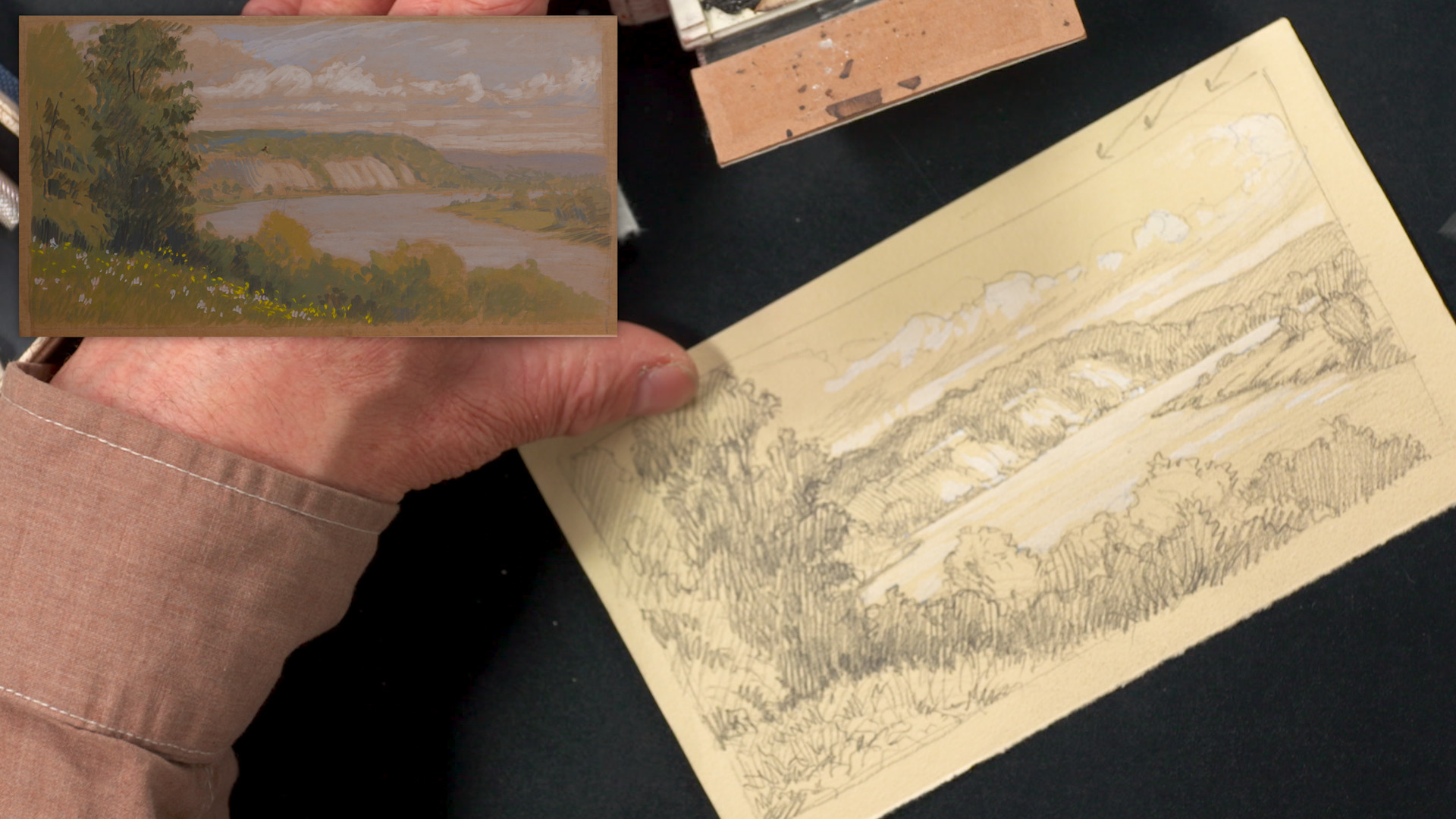
Stuart LoughridgeArtist Stuart Loughridge will be demonstrating a pencil drawing on toned paper. He is working from a cartoon, a gouache landscape painting on cardboard that was compiled from several sketches on location.
Stuart begins with a frame and starts to draw the gesture of topography and contours. He works light to build a scaffolding, finding the big lines. Then he can start refining with firmer—not firmest—line work. He starts in the background with the clouds, noting that clouds move fast in nature, so you will just have to commit to a moment while sketching and draw what you see. He moves down to the bluffs and shoreline, cleaning up with an eraser as he refines. He’s only worried about the placement of objects at the moment. He corrects and moves objects to strengthen the overall composition while describing the movement of the landscape.
Now, in the foreground, he starts with the trees along the riverbank and into the hillside. He builds a skeleton of a trunk for the main foreground trees to build the foliage on. Now he starts to shade, starting from the background, with some light value. He lays his lines down carefully and presses his pencil down more to commit to an outline. He follows the contours of the initial topography lines, allowing his hatching lines to roll on them. He advises to remember your light direction as you lay in your shadows to bring out form and look for cast shadows.
He moves his way to the foreground, accenting the trees and suggesting branches and foliage edges. He uses bigger strokes with the broad side of his pencil to cover the foreground with tone. Next he solidifies some outline and secondary darks, making full use of his 2B lead pencil. Once he has his full pencil value range, he moves on to describe the passages the depth of the scene, always stressing what’s in front of other objects.
Once the sketch is solidified, he starts to add some white paint highlights. He follows the motions he described earlier, starting in the clouds and then moving forward. He suggests not covering completely in white—just suggest texture. He explains that you can vary the paint between thick and thin to develop the textures. If you accidentally use too much white, you can just bring your pencil back and draw on top. Stuart reminds us that less is more when working with the opaque white.
