Oil Painting Colors for Painting Flowers
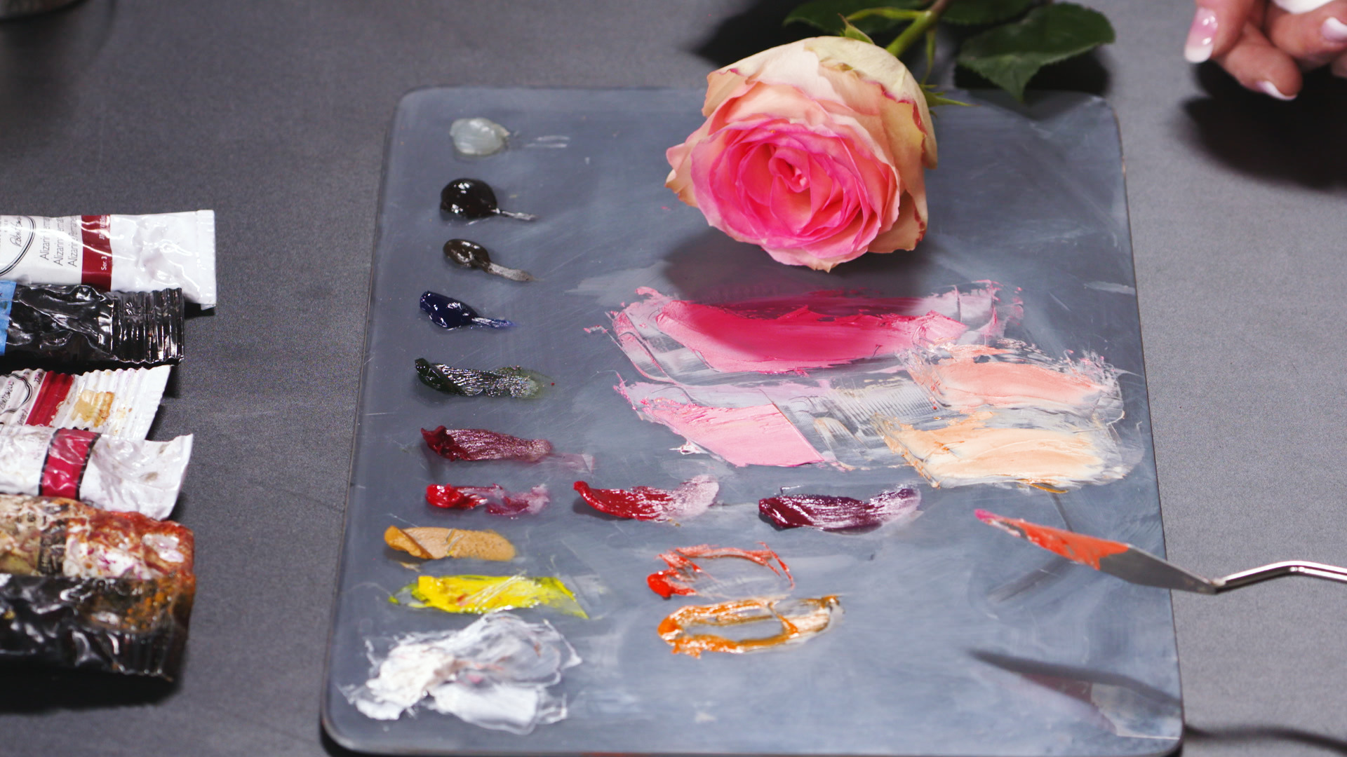
Katie LiddiardFlowers give us some of nature’s most beautiful colors, but as an artist, capturing those colors isn’t always easy. Artist Katie Liddiard shares her tips for a palette that will set you up for success and joy in painting flowers with vivid, vibrant tones. Working with a sample of a lovely variegated rose that has shades of pink, purple, orange, and more, Katie chooses pigments that will naturally work well as you replicate these hues.
First, Katie compares modern quinacridone pigments in rose, red, and magenta (there are many more pigments in the quinacridone family as well) with more traditional alizarin red, an earthier tone. Each one mixes slightly differently, but the quinacridones are superior to alizarin in achieving floral colors. Mixed with white and a small amount of yellow, quinacridone rose yields a gorgeous pink, while alizarin creates a duller color (though it’s still a wonderful and versatile cool red that you’ll use often in painting many subjects). For flowers in the orange and yellow range, Katie pulls in cadmium orange, a strong pigment, and orange molybdate, a brilliant orange. Mixed with white, these can create the creamy flower-petal shades that are so gorgeous in nature.
If flowers are a favorite painting subject, be sure to explore the quinacridone family of pigments along with the vibrant oranges that Katie suggests. You’ll discover that you can learn to paint flowers expressively without ever being disappointed in the colors you can mix and the results you get.
Hi, have you ever tried painting flowers and been frustrated by the colors that you're getting out of your paint, because it's not quite replicating what you're seeing in nature? Hi, I'm Katie Liddiard and I'll tell you the colors that I use to get those really beautiful, punchy, vibrant colors from my flower paintings. As you can see, there's some beautiful pinks and purples and oranges and yellows in this gorgeous flower here, but how do I make that from my colors? Well, some colors are going to be naturally better at replicating those colors than others. So I have my quinacridones here.
I have my quinacridone rose, red and magenta and then I have my alizarin here and I'll show you the difference that quinacridones will get you versus alizarin. So I will show you how each one mixes and why these really are the superior choice for flowers. So if I just grab a little, you can already see just how punchy that is. There's a lot of pigment in there, but look at that beautiful pink. So if I pull that over, it's just about there.
All it needs is a little yellow. Ooh. And look how close. But if I try to do that with the alizarin. Grab a little alizarin here, the problem is, the alizarin tends to be a little more earthy.
So when I mix anything with it, I get a really beautiful red with white, but if I mix some yellow in there, it tends to go more brown. So even if I try to brighten that up to replicate what I'm getting here, it's never really going to get me where I wanna go and the more white I mix in with it, the more kind of dull it makes the color overall. So instead of getting really bright, punchy pinks, I'm getting kind of dull reds instead. So that's why quinacridones are beautiful for that. And then if I need something a bit more orangy, yellowy for depending on, obviously what flower I'm painting, then I'll pull in my orange molybdate, which is a really, really punchy color, lots of pigment in that color.
You only need a little bit to get where you need to go and then I also have, excuse me, that was the wrong color. That's my, okay, let me wipe this off. That's my CAD orange, not my orange molybdate. Okay. Okay.
Do you kind of know where to pick up from? Yep. Anytime you're ready. Okay. So if I'm needing more yellows, oranges, but I still need that punch, I'm going to pull in my CAD orange here, which is really, really bright.
You can pull in some white here and you can see just how creamsicly bright and punchy that is. That's really awesome for some of these inner tones there. You can kind of see maybe a a little bit right there, just slightly orange. It's not that orange, I would have to kind of mix that a bit more, but just some of those really warm colors inside the flower and then I have some orange molybdate here, which is kind of a mix between my reds and my orange here, which again, is just beautiful and punchy, but somewhat soft for some of the tones going on here on the outer edge. So again, depending on your specific flower that you're painting and kind of the color needs that you need within that, I would highly recommend you get some quinacridones to get that punchy, beautiful, vibrant color that most flowers will have in their pinks and then alizarin is really great for kind of overall, all around, kind of red, cool red work.
So I hope that was helpful and happy flower painting.


Nicely done mixing quinadrone red white yellow cadmium orange Alazarin red is not soft enough