Colors
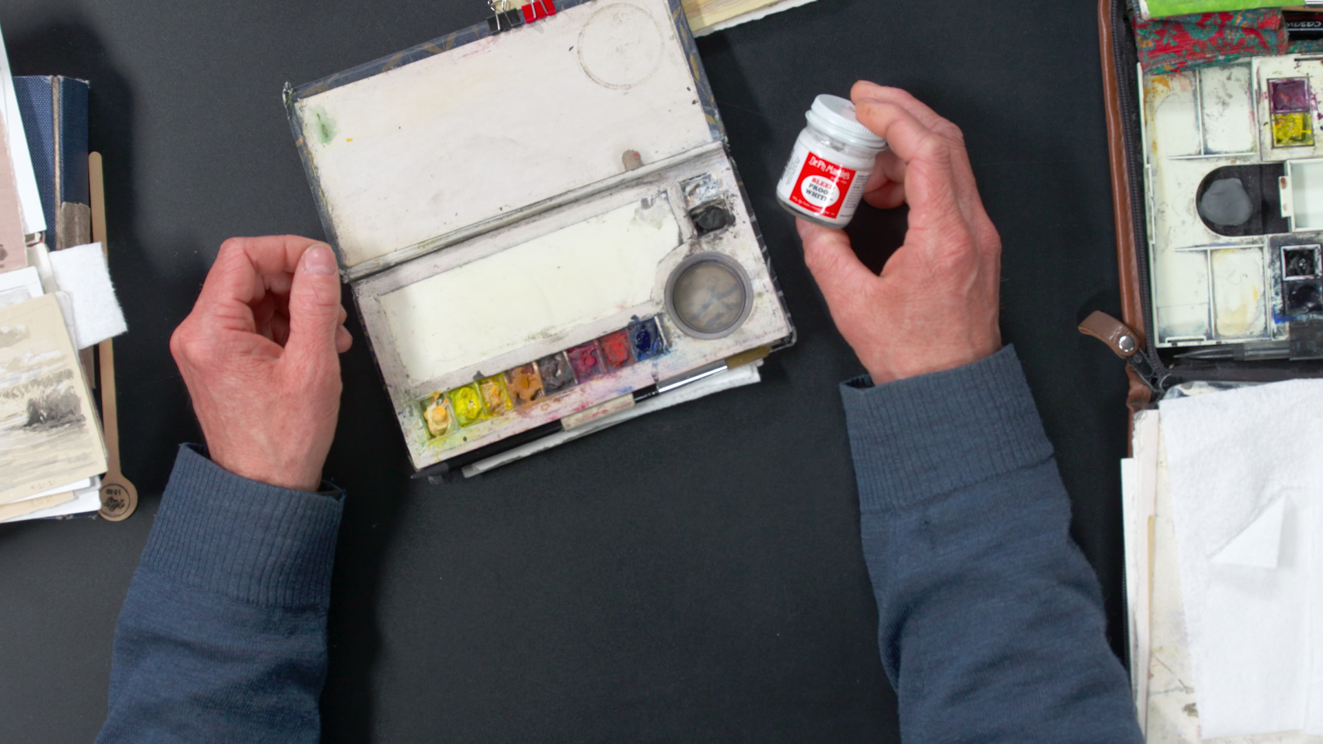
Stuart LoughridgeStuart Loughridge talks about the colors he has in each of his sketch kits. In his small sketchbook, he only carries black because it matches the pencil graphite well. On toned paper, he can use Dr. Ph. Martin’s Bleedproof zinc white to expand the value range with the black. You can also use titanium white gouache, but it dries darker, which is why he prefers to use the zinc white.
In his pocket-size color book, he has titanium white gouache, which is supplemented with the zinc white. The titanium creates opacity in the colors. It lessens the chroma, but builds body in the paint so that it’s not so transparent and can be used in initial washes to tone the paper.
Moving on to the rest of the palette, he has either carbon or ivory black, French ultramarine blue, cadmium red, permanent rose (avoid alizarin crimson), sepia or burn or raw umber brown, raw sienna, cadmium yellow deep, cadmium yellow light, and Naples yellow. Permanent rose is great for adding a nice pink of a sunset or portrait that the cadmium can’t do. Different brands of Naples yellow react differently, so Stuart recommends experimenting with several. It’s mixed with white, so it’s more opaque and less chromatic than the bright yellows.
Stuart mixes his own greens with the ultramarine and Naples yellow first, then moves onto his other yellows if needed. He prefers to work into a minimal color palette and then push the chroma where he wants the eye to go. Showing some of his sketches, he demonstrates some of the different colors and high and low chromas.
He advises that you should be careful when mixing white into the colors by keeping it separate on the palette, or else the whole palette will turn into opaque paint.
The pocket-size color book is a minimal palette with the primaries: yellows (Naples, cadmium deep, cadmium light), reds (warm brown, rose, cadmium red), blues (ultramarine, black), and whites.
The big palette has two different Naples yellows, cadmium orange, raw sienna, raw umber, burnt umber, permanent rose, cadmium yellow light, burnt sienna, Venetian red, cobalt blue, French ultramarine blue, Prussian blue, Payne’s gray, and ivory black. So it has the same yellow and red range that the smaller palette has, but has an expanded blue range for skies and greens.
It takes time and practice to find out what you like to use, but Stuart advises to limit the chroma and then expand the chroma as you need it. Limit your palette to three colors as you develop the sketch and introduce another color with more chroma to push it farther.
